In Praise of Americana: on the road with Ed Freeman
All photographs used by kind permission of the photographer, whose work can be purchased at www.edfreeman.com
If Anglophilia is love of things old, small, and restrained, Americana celebrates all that is big. It expresses the massive scale of America, realised in spirit and aesthetic. Its kitsch is loud and brash: not the quaint and dainty kitsch of English tea rooms or the neat fonts of Blitz spirit posters. Americana is multitude, landscape, colour. And underneath it all is a lostness, a roving quality that belies this culture of confidence. It is the instability of youth. Big, big, bigness uneasily compensates for the adolescence of a nation.
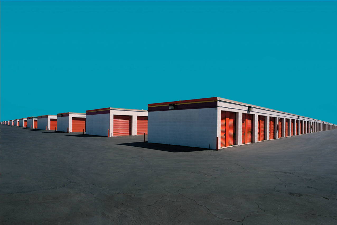
Ed Freeman’s photography series, Desert Realty and Urban Realty, use the landscape and architecture of America to illustrate the country’s unstable aesthetic. Commercial outlets are isolated from the buildings that would surround and protect them. Unable to blend in unexamined, the structures are stranded in their landscape. They seemingly sit in empty lots or desert dust. Colours and effects are digitally enhanced: in one photograph the patriotic red, white and blue fronting of a generically branded “Food Mart” is offset by a shifting, uneasy grey sky. In another, a startling blue expanse of sky serves to heighten the unreality of sunnily painted Weinerschnitzel Drive-Thru; the effect is similarly disquieting. The primary colours of Americana, colours that are supposed to signify celebration of a nation’s values, are instead used to question what those values are.

Urban Realty 16
“In my mind, all I’m doing is making these buildings more of what they already are,” Freeman tells me. “I’m optimising them, isolating them and putting them into backgrounds that allow them to show their true colours, the same way a jeweller might choose to put a gem in a particular setting.” It is a core aspect to the power and effectiveness of the series: America speaks for itself, the images illuminating issues that are literally built into the nation.
Commercial buildings are a key feature: diners, fast food joints, and a building marked only by a large painted-on panda (all that’s needed to denote a Chinese restaurant). The pristine exteriors of these places interact uncomfortably with their raw backdrops, giving a sense of disjunction between the self-assured frontages and the indefinite realities of America. In Freeman’s Desert series, the clean lines of urban structures are replaced by worn slumps of building: abandoned lots and houses that are old without being antique. They speak of a process of decay, but a decay that is young yet. This same theme is more subtly apparent in the brightly coloured façades of lots like the Food Mart: boldness that speaks of superficiality, of impermanence and fast turnover.
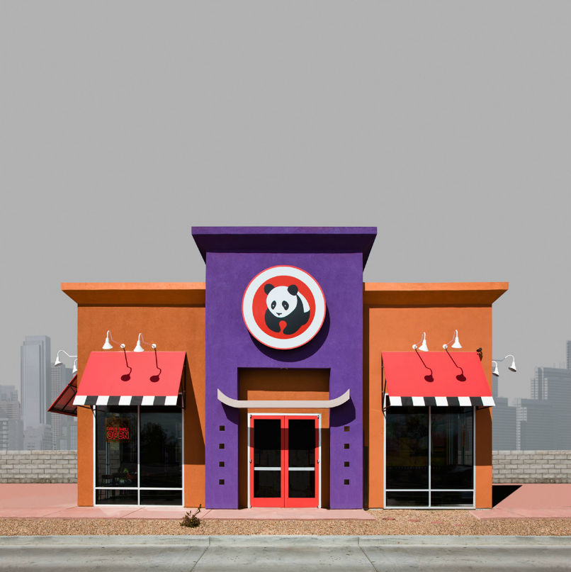
Urban Realty 19
Yet Freeman rejects the imposition of a line or message in his work, saying that “purpose and agenda are first cousins. I just photograph what moves me”. As the comment implicitly recognises, the immediate emotional effect of his works are precisely where politics comes to the fore. There is, for instance, a recurrent sense of jaded youth across the pictures – or even disturbed innocence. In one photograph, a children’s playground slide is lit up in bright yellow and its childish tower design parodies the skyscrapers that form the ominous, iron-grey cityscape in the background. Their phallic architecture is mimicked in the child’s world of the playground. Disjunction between the two layers of the picture tells of the prevalence of America’s adult values: commercial culture is inescapable, even in juvenility.
All is conveyed simply by what Freeman calls “optimising” existing structures, and making use of the gut reactions they evoke.
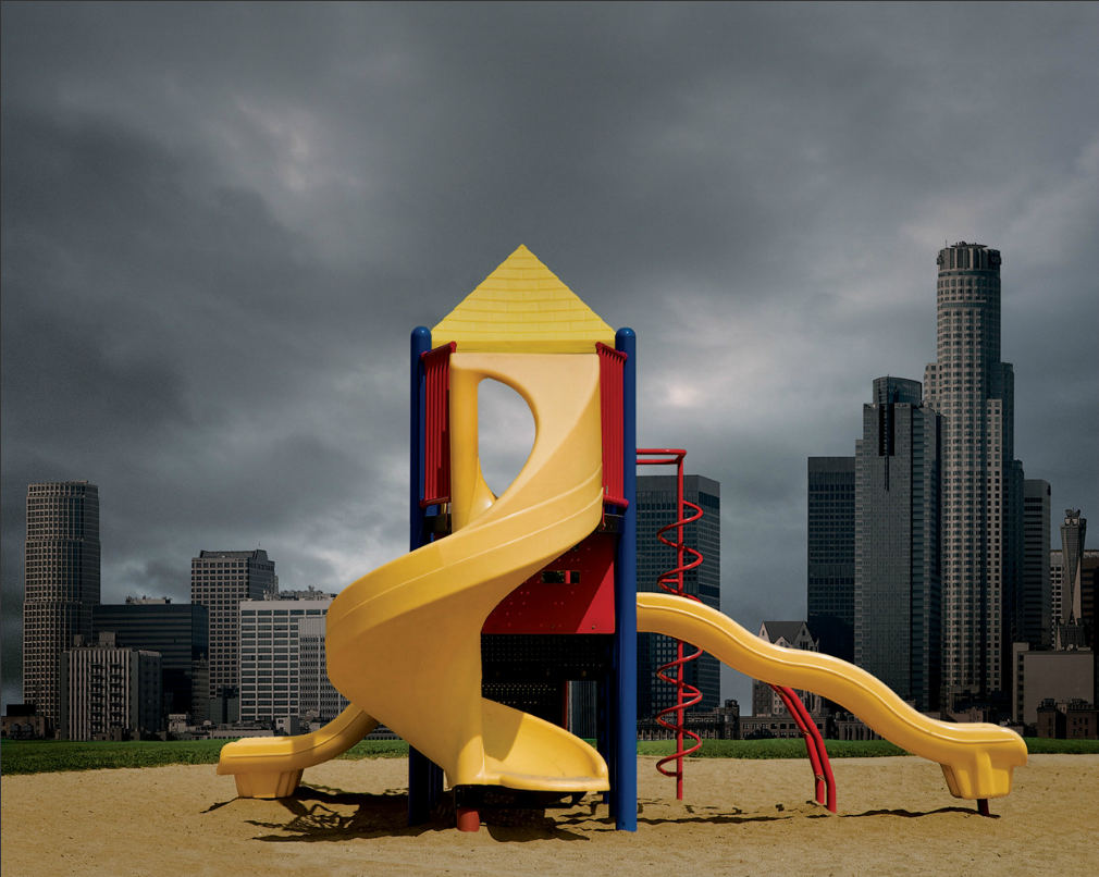
Urban Realty 23
Freeman uses the series to explore not only the darker sides of the American aesthetic, but also its expression of joy. “There’s a political statement in these pictures, but not just one,” he says. “I love my country and I am appalled by it at the same time.” The love comes through in images such as the “CAL-TEX” auto-parts store: a vision of undeniable vivacity. The building is slightly decrepit with a glorious, sunny exterior, just a little bungalow squatting comfortably beneath a towering skinny palm tree. Both are natural in the landscape. The poverty apparent in the run-down structure doesn’t seem depressing or necessarily at odds with the overall sense of brightness and colour. It is a picture that speaks of mixed heritage, the warm yellows and blues evoking Mexican influence, an impression reinforced by the palm and desert environment. In the architecture there is a sense of America’s implacable economic spirit: the raggedness of the operation, elevated and enlivened by radiating colour. Across the series, that interaction between the landscape and the architecture reinforces the idea that these structures manifest a worldview partly inspired by the land itself.
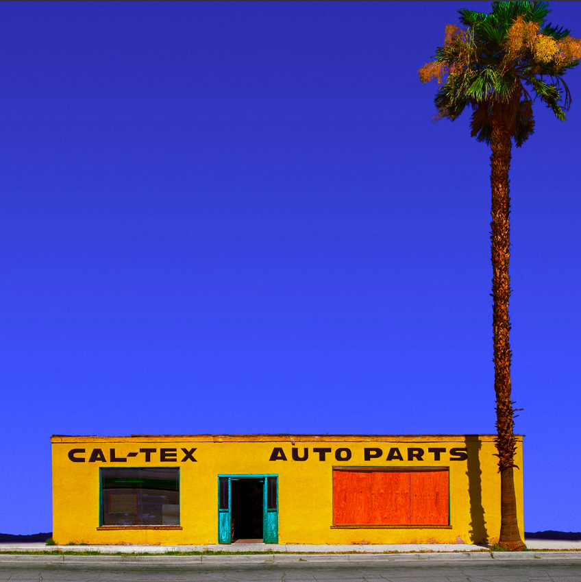
Desert Realty 10
America’s comparatively recent history involves struggle for survival in this vast expanse of desert, and mountain, and plain. The country’s size is the result of endeavour, contest with the land, and relentless celebration of its seemingly inexhaustible bounty. It came to define the American aesthetic: big spaces and correspondingly big cities. Americana expresses the psychology of a country that has a history of big ideas and a view of their place in the world that is of corresponding scale. All this is captured in the crackling unease that laces Freeman’s photos.
It is an unease which speaks to America’s core values. Freedom is at the centre of the American ideal, “but the price for that freedom is loneliness, and Americans are the loneliest people I’ve ever seen. You have an uncanny mix of strident individualism and bland uniformity that is a perplexing, defining element in the American character.” Like the animated skies and creaking shacks of the American desert, or the energy that resides in the interaction of various textures of a grey in an apparently bland industrial scape, antithesis and contradiction define Americana. “It’s exuberant, it’s frightening, I thrive on it and I hate it,” Freeman muses. “And I guess it shows up in my pictures without me even trying to put it there.”


